Want to work with our team?
Get in touch
This article is the sixth in a series of articles that explore the features of Shopify Plus.
This article will take a look at the Checkout customisation options offered to Shopify Plus merchants.
Part 6 – Checkout customisation
Any well designed Shopify store should naturally ooze excellence, individuality and authenticity, all while conveying a message of brand integrity and trustworthiness to their customers.
When choosing an approach to store design merchants have numerous options. They can opt for the implementation of a theme – free or paid – and install it themselves, they can find a developer to customise an already-existing theme to their brand specifications, or they can opt for a entirely bespoke approach. If executed correctly, any of these approaches should be able to achieve the qualities listed above.
Read more about the discourse surrounding Shopify themes vs Bespoke builds here.
However, no matter how beautiful your Shopify store is, when a customer arrives at the checkout, a store’s brand identity can sometimes lose its impact.
The Shopify checkout
The checkout is a crucial part of the customer’s journey through any online store. For the non-Plus merchants, however, checkout customisation is off-limits. And for those store’s with loud (of very specific) brand identities, the default Shopify checkout could appear a little jarring in comparison to the rest of their store.
The default Shopify checkout is not ugly. But it’s not particularly pretty. Due to its simple appearance, a store’s identity can potentially be lost at the final, most crucial step of a customer’s journey.
But not all merchants face this issue
Plus merchants are blessed with the ability to redesign and restructure the content in their checkouts, meaning that Shopify Plus stores are able to offer a holistic-like shopping experience where storefront and checkout are two parts of a wider, more brand-focused experience.
Customisation
Custom design
Plus merchants have access to the checkout.liquid file – the file that is key to the customisation of the checkout. Editing this file allows merchants to add, remove and reorder content, edit styles, colours and fonts, and generally manipulate the page to match the rest of their Shopify store’s branding.
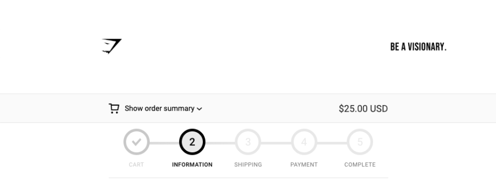
A popular, but simple design change that many Plus store’s opt for is the implementation of a custom breadcrumb menu. Their presence allows customers to see where they are in the site’s page hierarchy, and without them, customers can sometimes miss useful navigational signposting.
Shopify’s native checkout provides a basic breadcrumb by default. However, a simple redesign can accentuate the useful feature, ensuring users feel confident and in control when navigating your store.
Custom content
Social media login buttons
Allow users to sign-up and login to your store using their social media accounts, such as Facebook, Twitter or Google. This feature utilises the Plus-exclusive Multipass API mentioned in our last Shopify Plus article.
Address auto-completion
Merchants are able to utilise Google’s Autocomplete API to implement auto-complete functionality into their checkout. When customers begin typing their address, a custom auto completion menu appears, displaying autofill suggestions.
Discounts and promotions
The Plus-exclusive app, Shopify Scripts – discussed in another previous article – also offers ways to enhance the Shopify checkout. Using Scripts, Plus merchants can differentiate between customers, presenting customised discounts or messages based on various factors, such as customer tags, products in basket, total basket value, etc.
Wrapping up
A customized checkout alone is unlikely to convince a merchant to upgrade to Shopify Plus. However – for those with a subscription already or those considering the upgrade, Checkout customisation is a no-brainer and is yet another way that Shopify Plus enables merchants to further personalise their stores.
Want to work with our team?
Get in touch