Want to work with our team?
Get in touch
One of the many benefits of using Shopify is the Shopify checkout. It’s fast, flexible, secure, and easy to set up. However, if you have Shopify Plus, you can do many things to enhance and customise the standard checkout to improve the user experience and increase your conversion rate.
Customising the Shopify checkout is done by editing the Shopify scripts which is best implemented by an experienced developer. However, if you have an experienced Shopify developer on your team below are 10 ways you can optimise your Shopify Plus checkout.
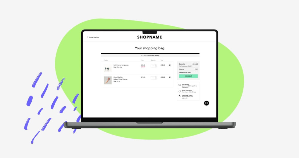
1. Look and feel
The Shopify checkout has a distinct design. And, whilst this does have its advantages as your customers may recognise and therefore trust the checkout. It does mean that it is similar to countless other checkouts and may not be in keeping with the look and feel of the rest of your website. You don’t need to reinvent the wheel here. The Shopify checkout follows some good checkout UX best practices, however, there are improvements that can be made and if you make it look more like your brand ultimately making the user journey more cohesive.
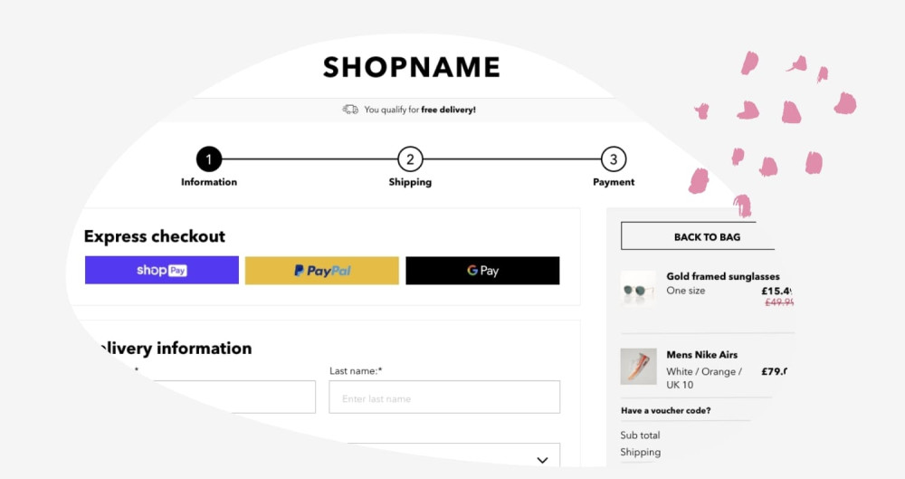
2. Breadcrumbs/stepped process
The standard Shopify checkout includes a simple breadcrumb navigation across the top of the page but it can’t be styled, nor the design changed. A popular amend to Shopify Plus checkouts is the redesign of this feature. By making it stand out more your users will know where they are in their journey and they’ll be able to easily see that the checkout process is simple and quick to progress through.
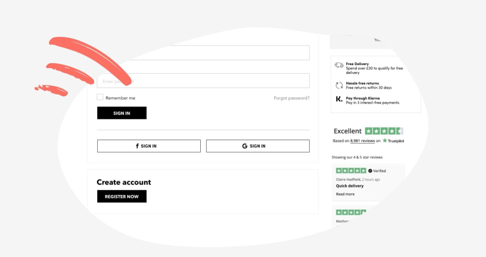
3. Social media login
We’ve looked at how we could improve the checkout experience on our client's websites and reviewed data on Crazy Egg. This highlighted that many users tripped up at the login phase. They often forgot their password and needed to go off-site to reset their password. This meant that the checkout process wasn’t easy or smooth for these users. By allowing social media login, users don’t need to remember the password for your website - a website they might not log into very often. Instead, they can log in with an account they probably use a lot more often creating a smoother, easier process.
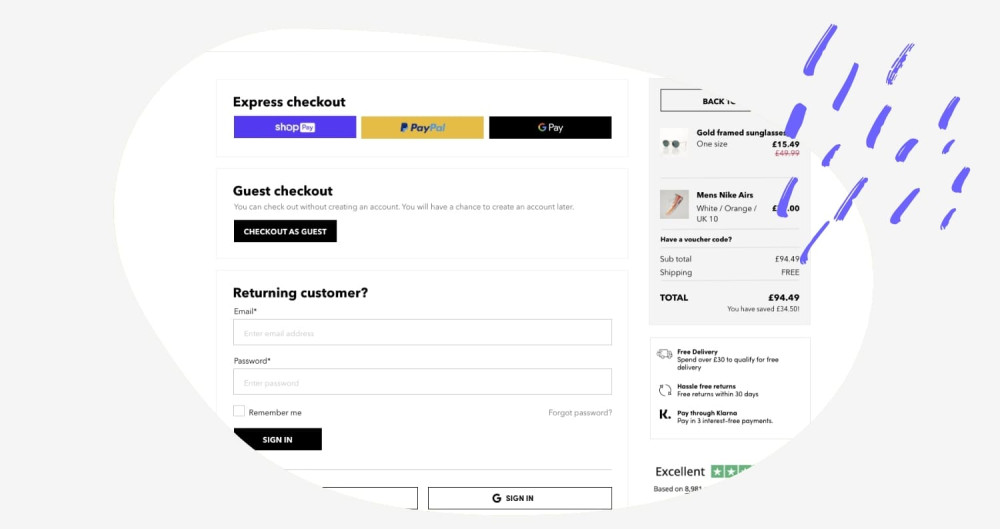
4. Guest login
Another way you can speed up the checkout process for your users is to allow guest checkout. This enables users to bypass the login process entirely and only input the details needed to complete the order. The downside to this is you do not receive their data and the user won’t receive tracking information about their order. However, once the user has completed their information you can ask them to input a password in order to create an account. If you explain the benefits of creating an account and even give them an incentive, often users will sign up.
5. Show additional costs upfront
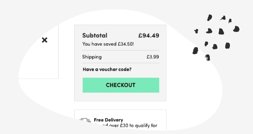
The number one reason shoppers abandon the checkout is because of the hidden costs (shipping, taxes etc) are too high. To combat that you can ensure that any additional costs are displayed upfront. Generally, on Shopify checkouts, the shipping/taxes are displayed on the shipping page of the checkout process. This means that the user doesn’t get to see these details on the product page, on the cart page, and on the first step of the checkout. By using Shopify scripts you can calculate the shipping and tax costs based on the user's geolocation and display it at every step of the process. When you combine that with Shopify's multi-currency features, your shoppers will know exactly what they’re being charged in their native currency.
6. Discounts and vouchers
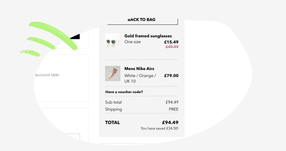
There’s nothing worse than applying a discount code and being told that you’re not eligible for the discount. By applying offers automatically at checkout the discount can just be applied once they’re eligible. For example, you can automatically apply free delivery when they spend over a certain amount.
7. Custom pricing
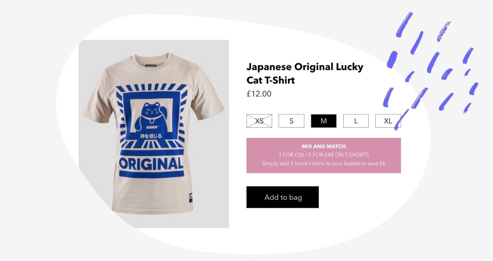
On Shopify Plus you can use scripts to set up custom pricing without using apps. You can easily apply bulk discounts and tiered pricing when the user reaches a certain threshold. This could be used to create bundle offers, differentiate between trade and retail customers or VIP and non-VIP customers.
8. Cross-selling
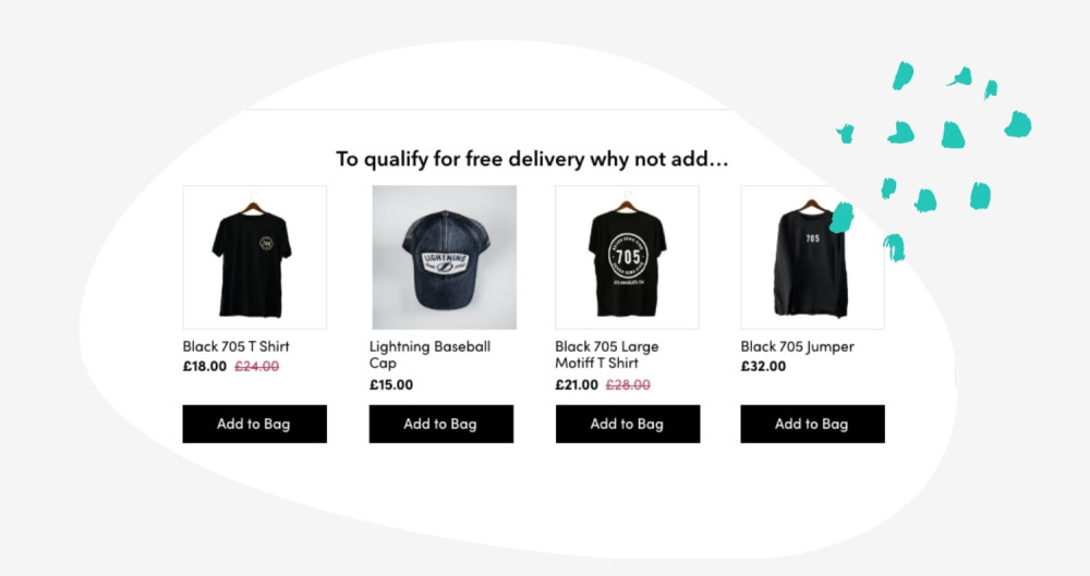
Websites often include upselling and cross-selling on the product page but what about the checkout pages? Once a user has added something to the basket chances are they’ve decided that your brand is trustworthy and you know you’re selling something they want. They’ve already decided on a product so they probably won’t change the product so upselling might not work here. But what about cross-selling? This could be particularly effective when combined with other messaging. If your store offers free shipping over a certain amount, and the user hasn’t yet reached that amount, why not show them products that will push them over the free delivery threshold? They get free delivery, whilst you make an additional sale.
9. Additional content
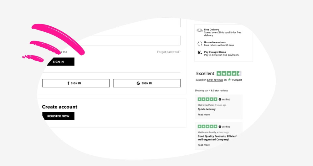
You can use Shopify scripts to display additional content that might help seal the deal and get you that sale. The user needs to trust your website and whilst the rest of the website should have been reassuring that your brand is trustworthy, there’s no harm reassuring them again at the stage they’re entering their credit card details. You could, for example, reaffirm your returns policy or share some customer reviews.
10. Post purchase page customisation
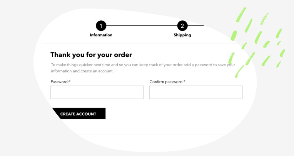
The post purchase page is the page that appears once the order is confirmed but before the thank you page. With Shopify Plus you can fully customise this page and include custom content on it. This potentially could include:
Product offers
Additional information, like a password input field to allow guest users to create an account.
Survey request
Discount codes
Newsletter sign-up
Don’t have Shopify Plus?
Don’t worry, all is not lost if you don’t have Shopify Plus, there are apps and extensions available that can help you achieve some of the above. Additionally, as standard, you can make some changes to the look and feel, such as:
Add your logo
Add a header image
Customise the font, colours, and text
You also have some flexibility around the form fields too:
Change the phone number to required or optional
Choose whether first name and last name are required or just last name
Include or hide company name field
Include or hide second address line field
Additionally, you can use ‘translations’ to amend the wording in the checkout. For example:
Change cart to basket
Change cell number to phone number
Update the T&Cs tickbox wording to something more meaningful
Although the options are more limited than a Shopify Plus checkout you do still have some control which will make the journey feel more seamless for the user. Also, you still get the security, speed and ease that having a Shopify website gives you.
Want to work with our team?
Get in touch


