Case study
eve sleep
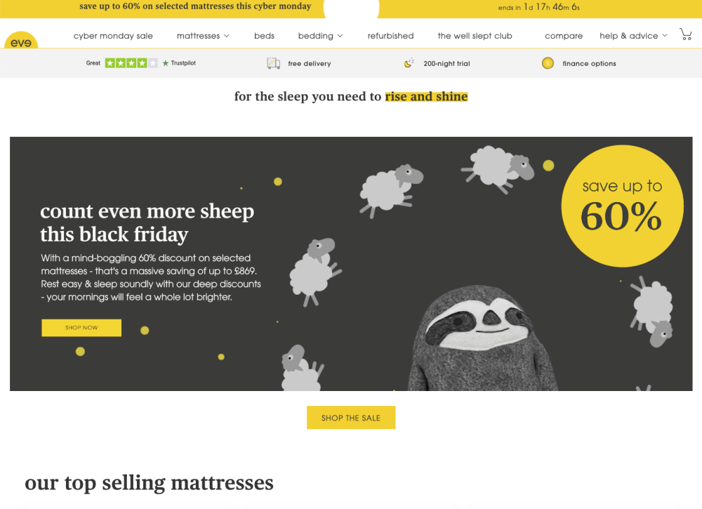
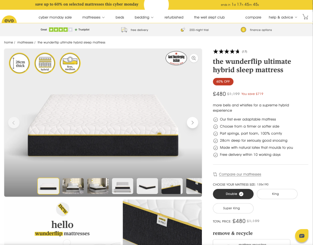
eve sleep is all about the “brilliantly bright-eyed and bushy-tailed bounciness” that comes from a great night’s sleep. The award-winning sleep-wellness company came to us for a shiny, new Shopify 2.0 website.
eve sleep wanted to to utilise Shopify’s lightweight theme, Dawn, as a base and use its inbuilt features and methodology to improve performance of their existing website, the results:
30%
increase in returning customer rate
57%
increase in sessions
150%
increase in desktop performance
Behind
The thought
The new eve theme was built upon Dawn's codebase, Shopify’s new 2.0 starter theme. Dawn’s development methodology uses a very modular approach, making the theme simple and easy to customise. When building the new website, we closely followed Dawn’s methodology, taking care to preserve the theme’s flexibility and approach.
Develop using Shopify’s theme, Dawn, as a base, which uses a lightweight HTML-first, JavaScript-only-as-needed approach
Extend Dawn’s functionality by building features that weren’t available in Dawn at the time
Result in a highly-performant end product
Behind
The mortar
Using Dawn as a base meant that there were a few important features that didn’t exist at the time. The key features that we needed to build from scratch were:
Breadcrumbs
Dawn does have breadcrumbs functionality, however, it isn’t in line with eve Sleep’s current designs. We updated Dawn’s breadcrumb functionality to be in line with their current theme’s breadcrumbs. This required:
Ensuring the breadcrumb links are SEO optimised
Adding the ability to toggle templates/pages on or off
Ability to create their own breadcrumb steps
USP Banner
We built a USP banner as a custom section as this does not exist in Dawn currently. The section will live as a fixed section below the Header section, and will accept up to 3 icon and text blocks.
Plus
Mega-menu
Mega-menus have since been added to Dawn, but at the time it wasn’t an inbuilt feature. We built a mega-menu that supported:
3 tiers of navigation
Featured products
The addition of custom tags next to navigation items
Specific colour product images
We needed to replicate functionality that when there are multiple colour variants the product images only display the images associated with the first colour variant. When the user changes the colour variant the images then update to the selected variants associated images.
Want to work with our team?
Get in touchSimilar
Work
Green and Wilds
All stemming from a conversation with a friend about Antler Dog Chews, Green and Wilds are all about natural, healthy products for our four-legged friends. They have a clear and direct vision to be a major brand in environmentally sustainable, nutritious, and just-plain-good products for pets.
Just Ingredients
Just Ingredients is big on ingredients. Huge, in fact. But one of the UK’s biggest online suppliers had even more growth in its sights. With Shopify Plus we increased basket orders by 34% and boosted returning customers by 42%.